A branding and web design agency based in san francisco. We believe design should be simple, beautiful and impactful.


tri-city eyes

THE BRIEF-

A brand identity project that aims to bring playfulness to the optometry space.

identity | business cards | marketing materials


the details

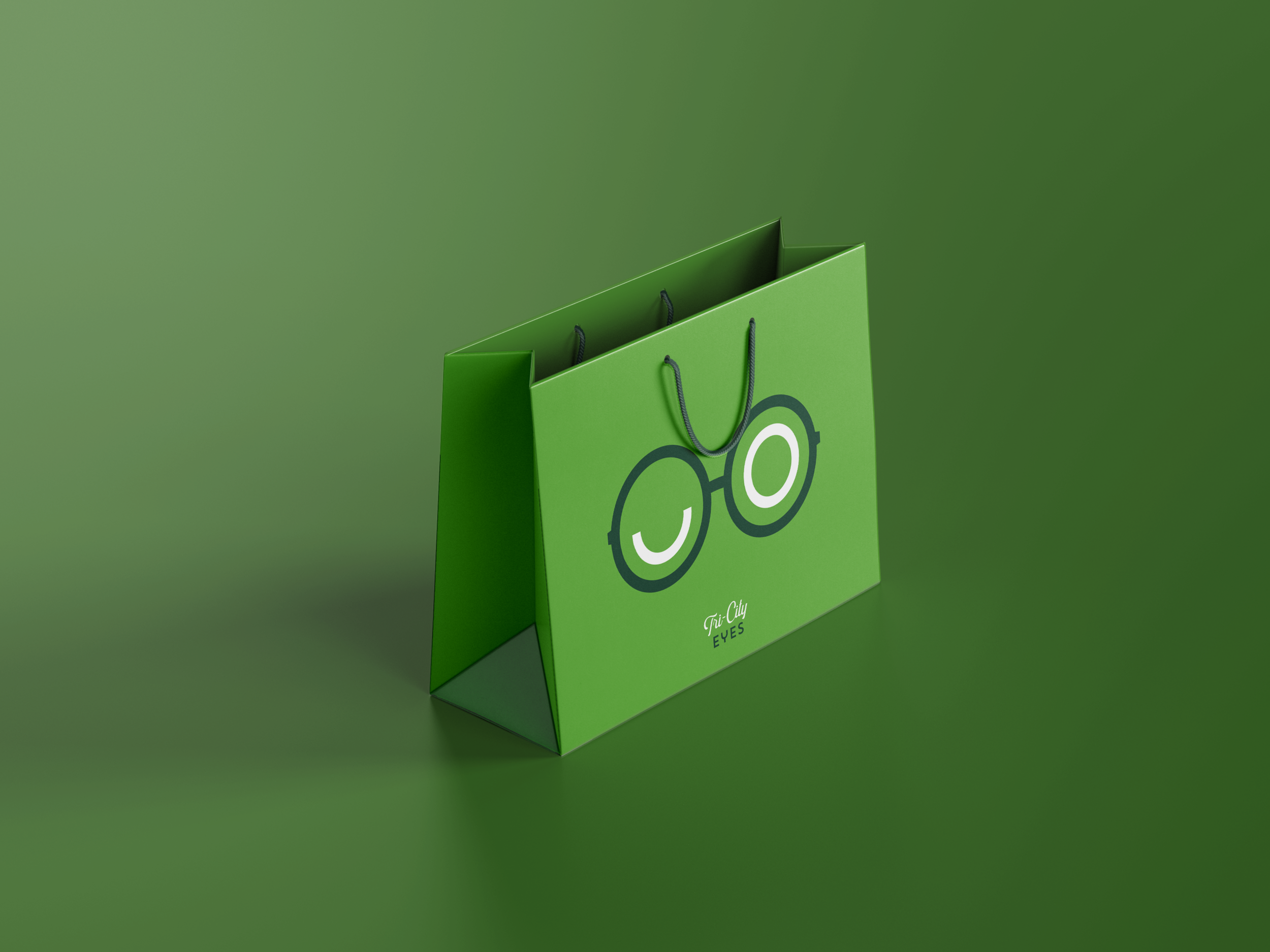
an icon that is simplistic yet playful

For their icon we were inspired to keep it absolutely simple, yet playful utilizing simple circles and half-circles that make up a pair of lenses in their most simplistic form. The circling eyes give a playful nod.


tri-city eyes Paper Shopping Bag Mockup.png
tri-city eyes Window Sign Mockup.png